FlowPas is a modern mobility brand rooted in clarity, structure, and forward motion. Inspired by the visual language of road systems, its identity draws from the geometry of a traffic intersection, reimagined into a circular form that symbolizes connection, continuity, and protection.

At its core, the FlowPas mark represents the seamless convergence of pathways, reflecting how movement, direction, and safety come together within a unified system. The outward flow of road lanes signals growth and expansion, embodying a brand that is constantly evolving and paving the way for what’s ahead.
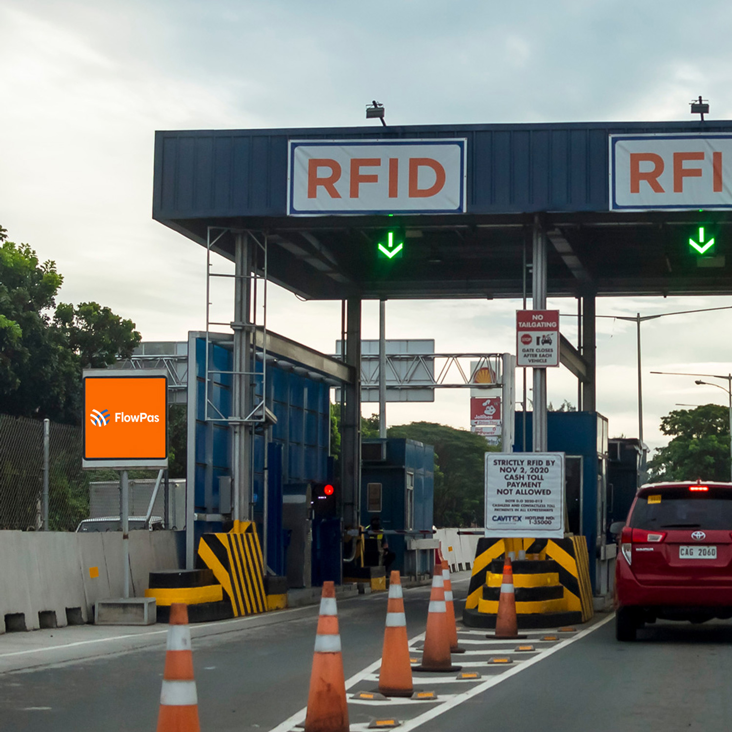
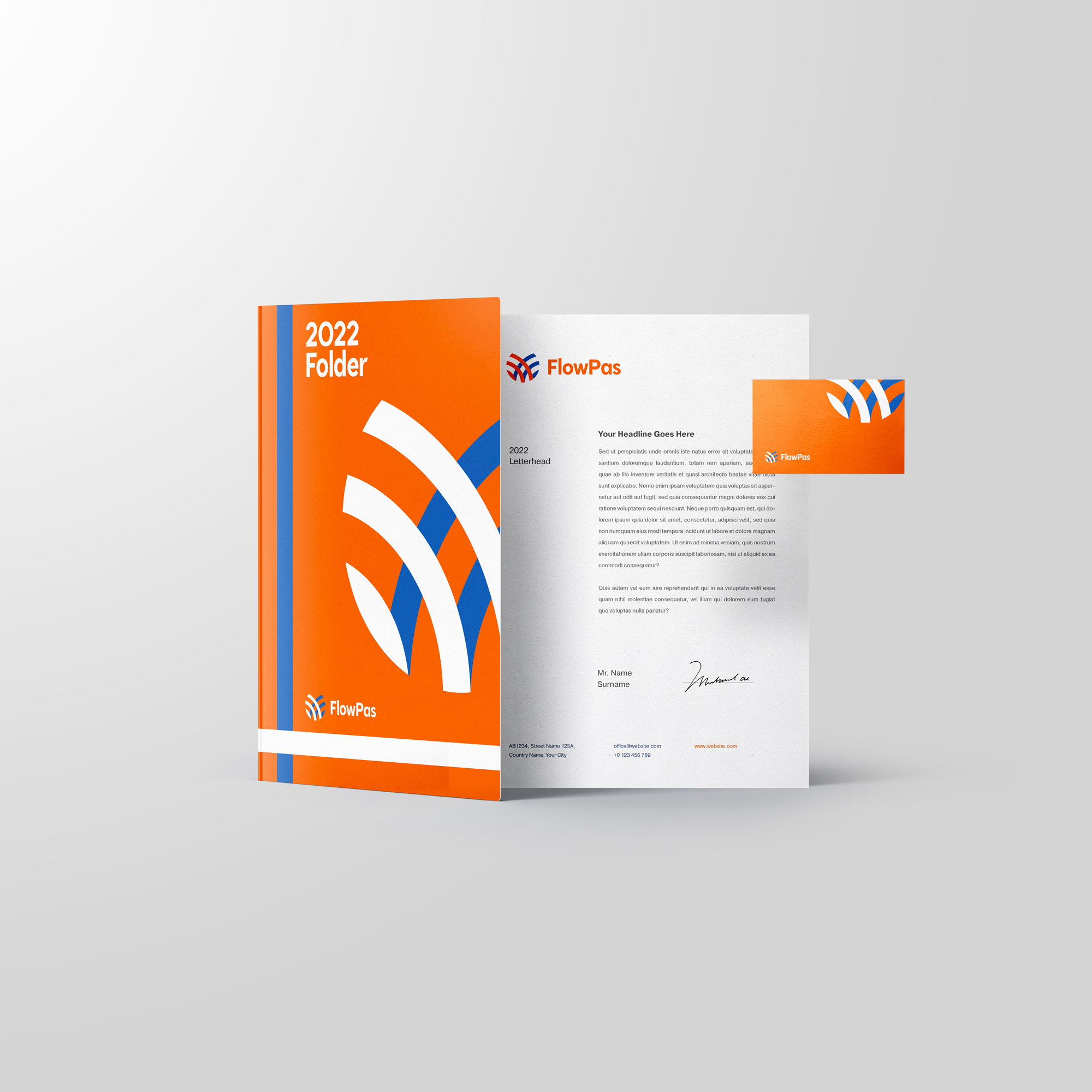
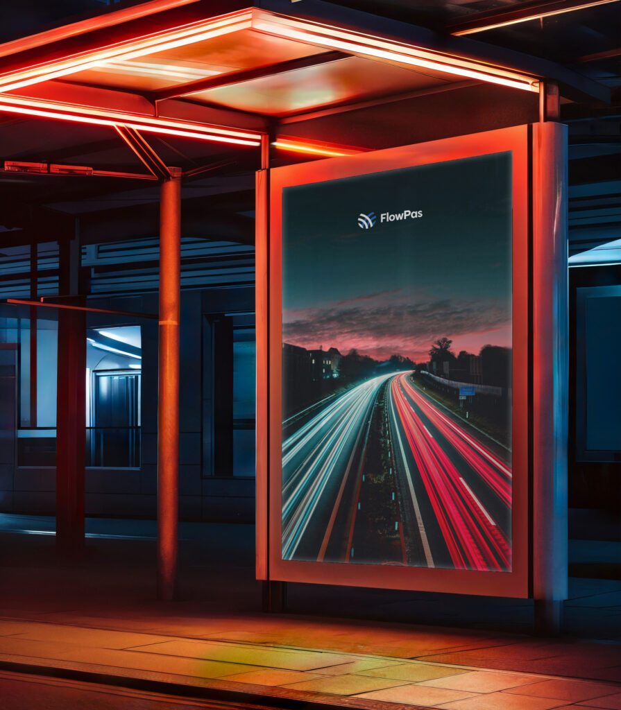
The geometric design language echoes the precision and familiarity of real-world driving environments, making the brand instantly recognisable while reinforcing its functional foundation. Balanced by a logo that is both playful and refined, FlowPas merges a corporate sensibility with a sense of approachability, perfectly suited to its outdoor context and user experience.
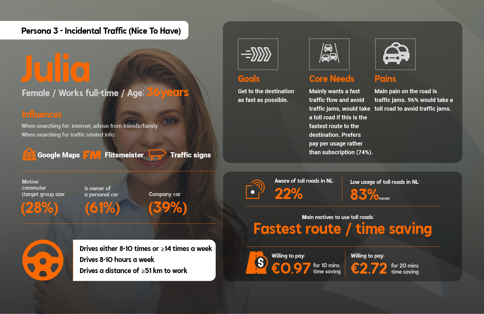
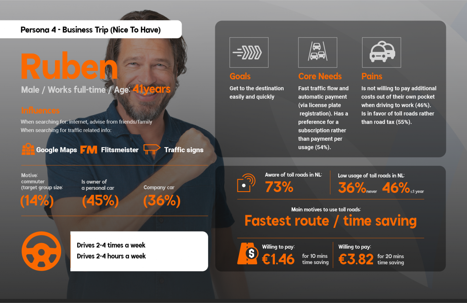
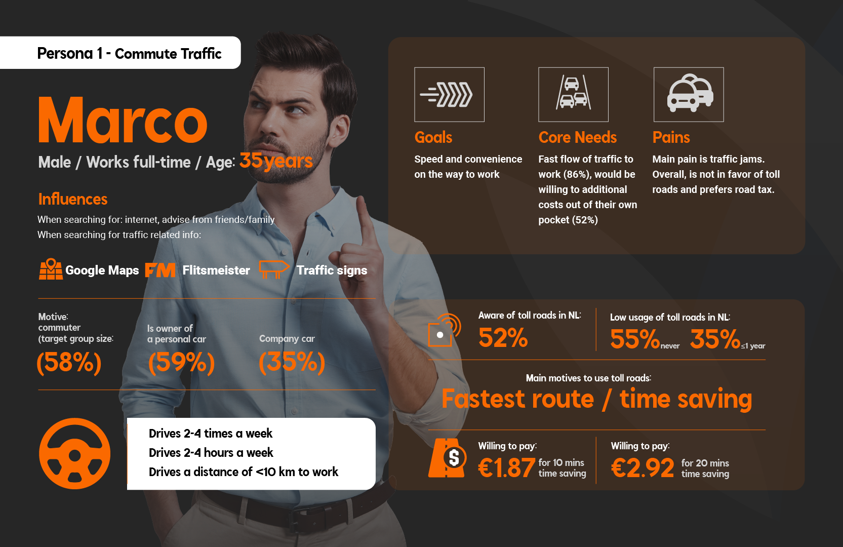
FlowPas stands as a symbol of intelligent design in motion, where structure meets creativity, and every path leads forward.

