Introduction
Perydot is a modern cleaning brand built on precision, reliability, and exceptional attention to detail. More than delivering clean spaces, the brand is committed to creating environments that feel refreshed, polished, and cared for through a consistently high standard of service.
Whether serving residential or commercial clients, Perydot approaches every project with professionalism, efficiency, and a commitment to excellence. Every interaction is guided by the belief that a well maintained space contributes to comfort, confidence, productivity, and overall wellbeing.
The identity reflects these values through a refined visual language that communicates clarity, trust, and sophistication. Designed to move beyond the traditional perception of cleaning services, the brand positions Perydot as a premium service provider that values quality, consistency, and customer experience.
Our role was to develop a visual identity that reflects the professionalism of the business while establishing a distinctive brand capable of standing out in a competitive marketplace.
The Challenge
The cleaning industry is often characterised by generic branding that focuses solely on function rather than experience. Perydot needed an identity that would communicate professionalism, trust, and premium service while differentiating itself from conventional cleaning companies.
The challenge was to create a brand that felt modern and sophisticated without losing the warmth and accessibility that customers expect from a service they welcome into their homes and workplaces.
The Strategy
Our strategy centred around repositioning cleaning as an essential service that enhances the quality of everyday environments. Rather than focusing only on spotless results, we built a brand around care, precision, and consistency.
Every creative decision was guided by three strategic principles.
- Precision creates confidence.
- Consistency builds trust.
- Clean spaces improve everyday experiences.
These principles informed the visual identity, creating a cohesive brand system that communicates professionalism across every customer touchpoint.
The Identity
The identity combines clean typography, refined graphic elements, and a fresh colour palette to create a visual language that feels modern, confident, and trustworthy. Every element was designed to reinforce the brand’s commitment to quality while maintaining a timeless and professional appearance.
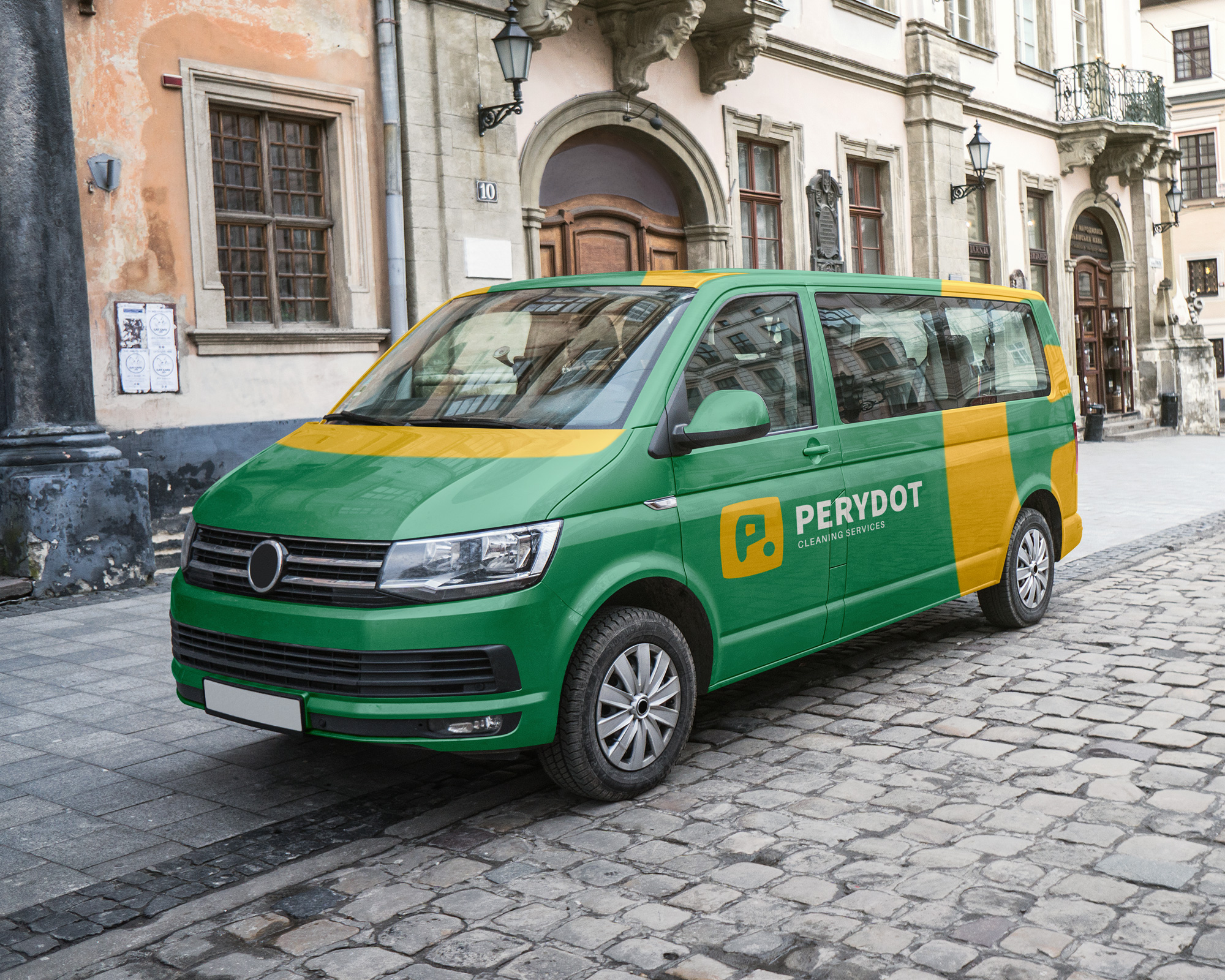
Built for flexibility, the identity performs consistently across uniforms, vehicles, digital platforms, marketing materials, packaging, and branded communications, ensuring the brand remains recognisable wherever it appears.


Bringing the Brand to Life
The identity was applied across a wide range of customer touchpoints to create a seamless and professional brand experience.
From vehicle branding and staff uniforms to digital marketing, stationery, social media, and promotional materials, every application reinforces Perydot’s promise of quality, reliability, and attention to detail.
The result is a cohesive brand system that strengthens recognition while creating confidence in the service before the work even begins.


Deliverables
Brand Identity Design, Logo Design, Visual Identity System, Colour Palette, Typography System, Brand Guidelines, Marketing Collateral, Vehicle Branding, Uniform Design, Social Media Assets & Digital Brand Assets.
Results
Perydot now has a distinctive and professional brand identity that reflects the quality of its service and the attention to detail behind every customer experience. The new visual system positions the business as a premium cleaning brand while creating consistency across every touchpoint.
More than simply refreshing the company’s appearance, the project established a scalable brand foundation that builds trust, reinforces professionalism, and supports future business growth.