Introduction
Township Spark is an initiative dedicated to unlocking funding opportunities for township based micro, small, and medium enterprises across South Africa. Created to bridge the gap between entrepreneurs, funders, and development partners, the brand exists to accelerate inclusive economic growth by supporting businesses with the resources they need to thrive.

Built on the belief that township businesses are powerful drivers of innovation, employment, and community development, Township Spark creates pathways for entrepreneurs to access funding, strengthen their businesses, and contribute to a more resilient local economy.
The identity reflects this ambition through a modern and credible visual language that balances institutional confidence with the energy and optimism of grassroots entrepreneurship. It positions Township Spark as a trusted partner capable of connecting opportunity with impact.
Our role was to develop a scalable brand identity that communicates professionalism, accessibility, and progress while supporting the organisation across digital platforms, stakeholder engagements, and strategic communications.
The Challenge
Township Spark required a visual identity capable of speaking to two distinct audiences. On one hand, it needed to establish credibility with government institutions, development agencies, and funding partners. On the other, it had to remain approachable and inspiring for township entrepreneurs seeking opportunities to grow their businesses.
The challenge was to create a brand that felt modern and professional without losing the sense of optimism, accessibility, and community that sits at the heart of the initiative.
The Strategy
Our strategy focused on positioning Township Spark as a catalyst for opportunity rather than simply a funding initiative. The brand needed to represent connection, empowerment, and long term economic transformation.
Every creative decision was guided by three strategic principles.
- Access creates opportunity.
- Entrepreneurship strengthens communities.
- Collaboration drives sustainable growth.
These principles informed the development of a visual identity that feels confident, optimistic, and flexible enough to support a wide range of communications and stakeholder engagements.
The Identity
The visual identity combines a bold colour palette, contemporary typography, and adaptable graphic elements that represent movement, growth, and connectivity. The design system was created to communicate confidence while remaining vibrant enough to reflect the entrepreneurial spirit at the centre of the brand.
Every element works together to create a cohesive identity that performs consistently across reports, presentations, digital platforms, marketing collateral, and future programme initiatives.


Bringing the Brand to Life
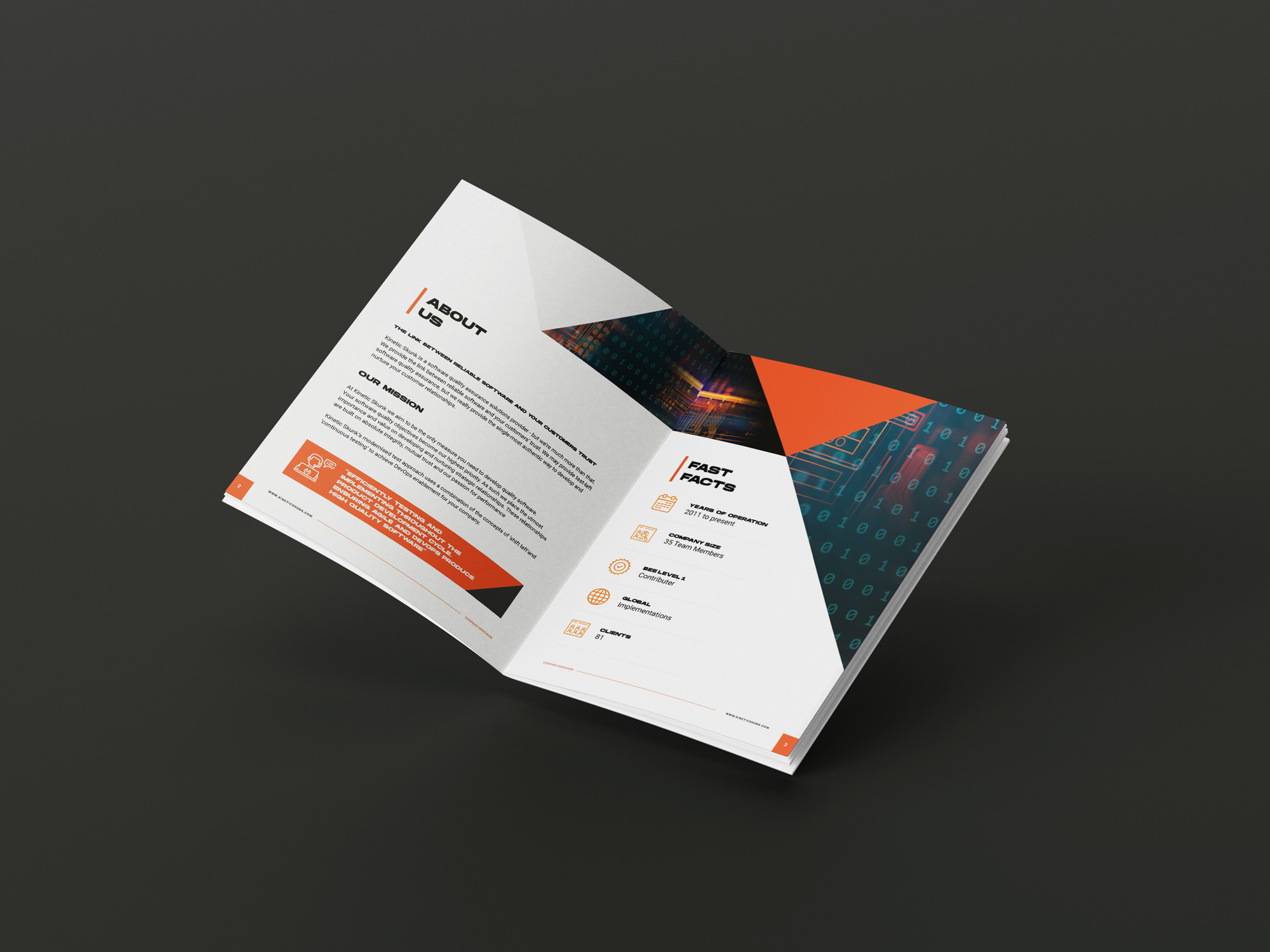
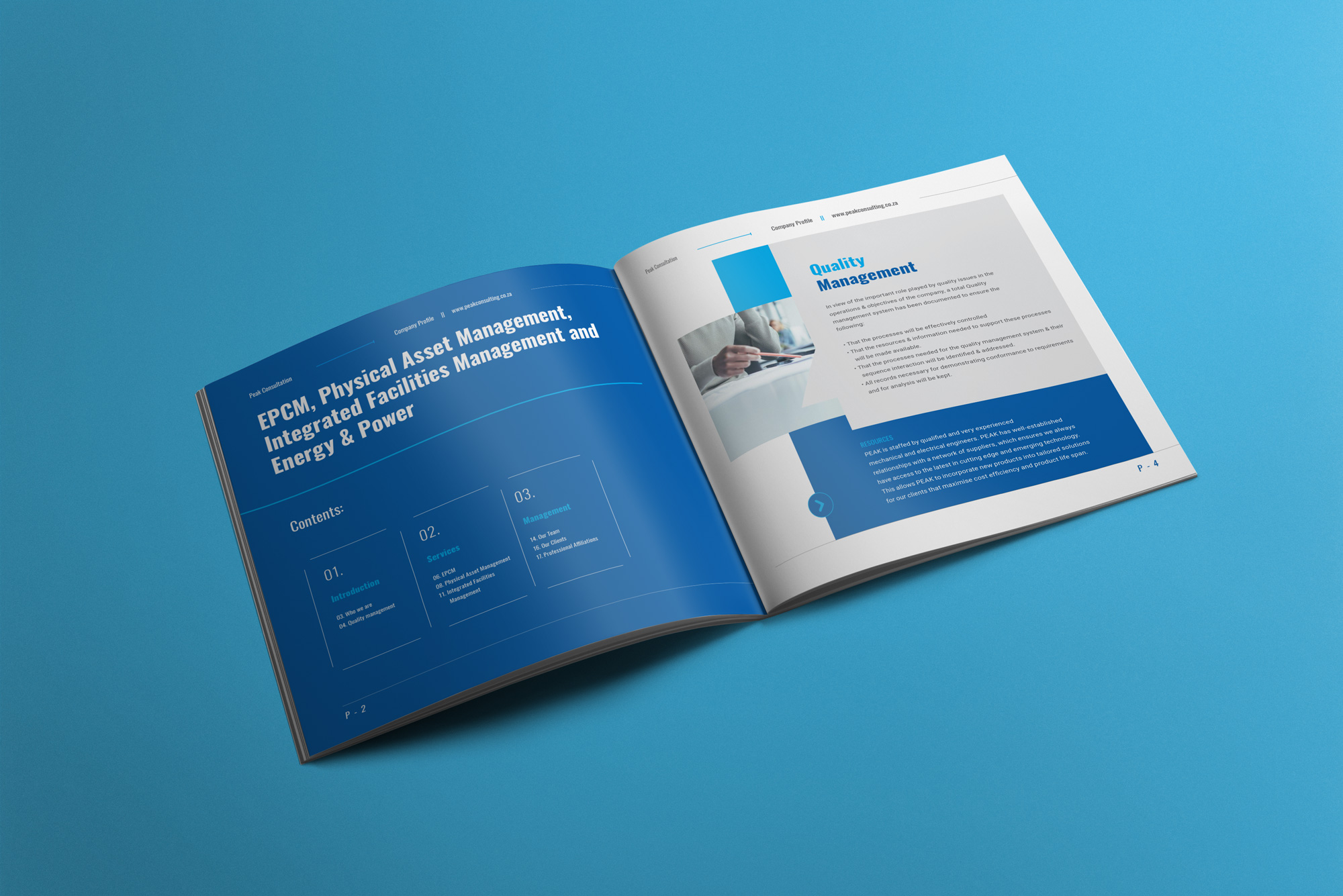
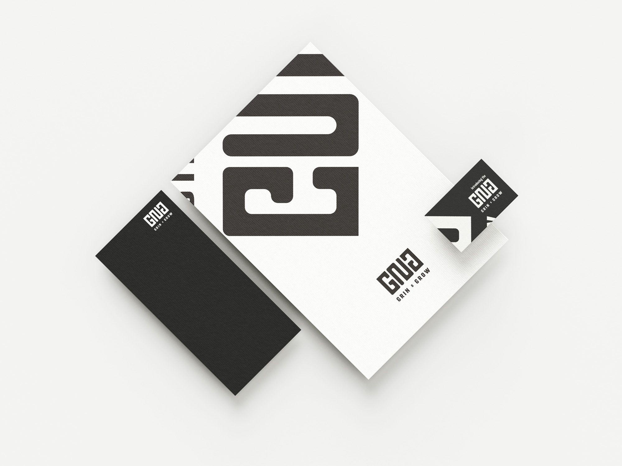
The identity was extended across multiple communication channels to create a consistent experience for entrepreneurs, partners, funders, and stakeholders.
From presentations and annual reports to social media, digital platforms, branded documents, and promotional materials, every application reinforces Township Spark’s role as a trusted partner committed to unlocking opportunity and driving inclusive economic growth.
The result is a flexible brand system designed to grow alongside the initiative while maintaining clarity and consistency across every touchpoint.


Deliverables
Brand Identity Design, Logo Design, Corporate Identity Development, Visual Identity System, Colour Palette, Typography System, Brand Guidelines, Presentation Design, Report Design, Marketing Collateral & Digital Brand Assets
Results
Township Spark now has a distinctive and professional brand identity that reflects its mission to unlock funding, empower entrepreneurs, and strengthen township economies. The visual system creates confidence among institutional partners while remaining accessible and inspiring to the businesses it exists to support.

More than a visual identity, the project established a scalable brand foundation that strengthens stakeholder engagement, communicates credibility, and positions Township Spark as a catalyst for innovation, investment, and inclusive economic development.