Introduction
Sew Bee Cause is a social enterprise dedicated to creating lasting social impact through sewing, creativity, skills development, and sustainable community initiatives. By equipping individuals with practical skills and opportunities for economic participation, the organisation empowers people to build brighter futures while strengthening the communities they call home.
As the organisation continued to grow, its visual identity and digital presence no longer reflected the depth of its mission or the impact of its work. The brand required a modern identity capable of communicating its purpose with greater clarity while building stronger connections with donors, partners, volunteers, and the communities it serves.
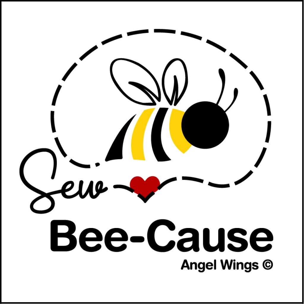
Our role was to lead a complete brand transformation, creating a cohesive identity system that reflects the heart of the organisation while positioning Sew Bee Cause for continued growth and greater visibility.
The Challenge
Although Sew Bee Cause had built a meaningful reputation through its programmes and community impact, its existing brand lacked the flexibility, consistency, and emotional connection needed to support its evolving mission.
The logo no longer reflected the organisation’s values, while the website struggled to communicate its story, showcase its initiatives, and encourage engagement from supporters and funding partners.
The challenge was to create a modern brand that balanced professionalism with warmth while remaining authentic to the organisation’s purpose.
The Strategy
Our strategy focused on bringing the organisation’s mission to the forefront of every brand interaction. Rather than simply refreshing the visuals, we developed a brand that communicates empowerment, creativity, sustainability, and community through a unified visual language.
Every creative decision was guided by three strategic principles.
- Purpose creates connection.
- Creativity inspires opportunity.
- Consistency builds trust.
This strategic foundation informed every aspect of the identity, ensuring the brand could communicate confidently across digital platforms, printed materials, fundraising initiatives, and community engagement programmes.
The Identity
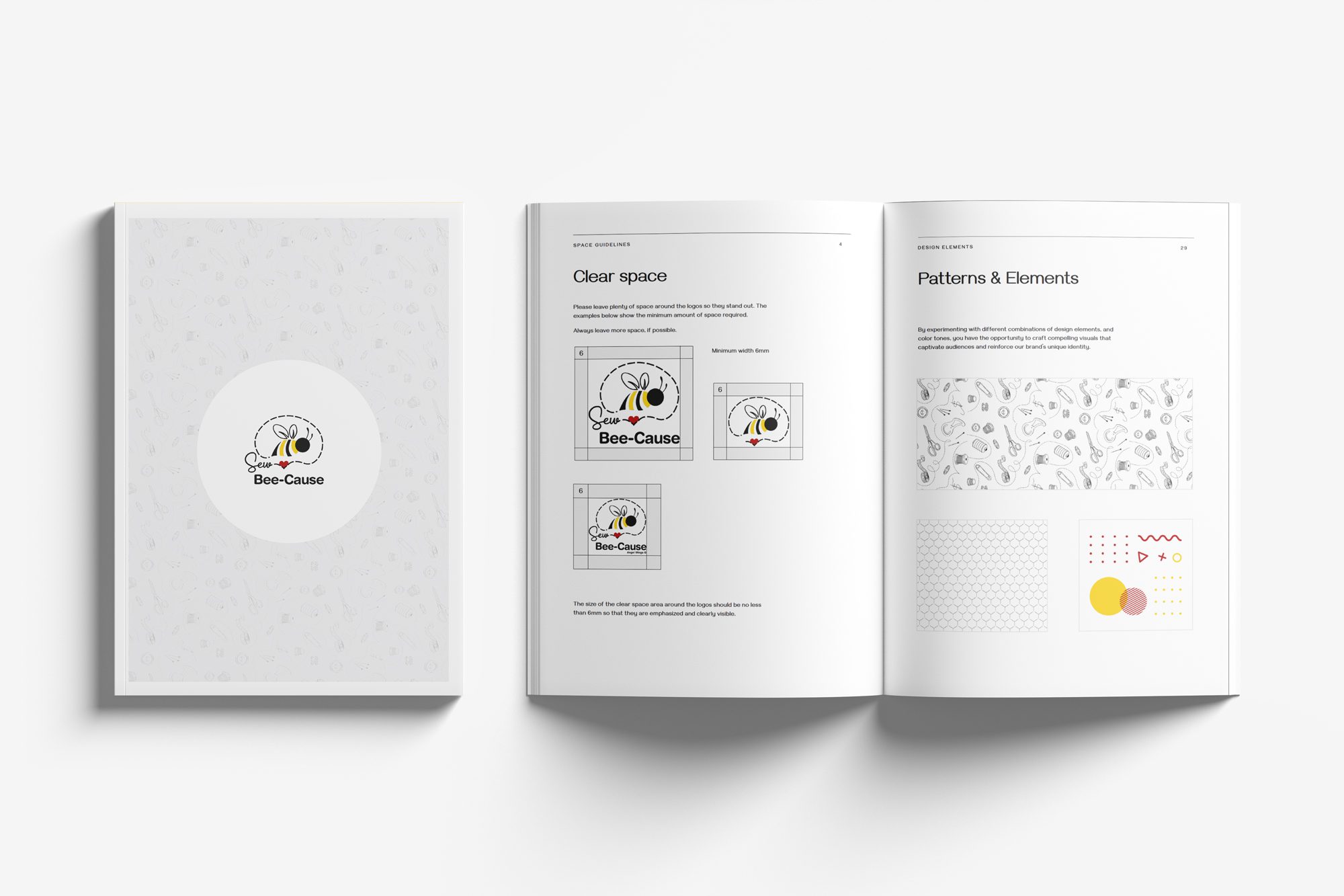
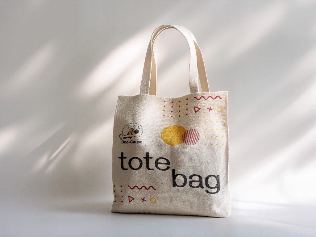
The refreshed identity combines contemporary typography, a warm and inviting colour palette, and symbolic graphic elements that reflect sewing, transformation, collaboration, and growth. Every element was intentionally designed to communicate the organisation’s values while creating a recognisable and memorable brand experience.
The visual system provides flexibility across a wide range of applications, allowing Sew Bee Cause to maintain consistency whether engaging with donors, programme participants, volunteers, or strategic partners.
Bringing the Brand to Life
The identity was implemented across multiple communication channels to create a seamless experience for every audience interacting with the organisation.
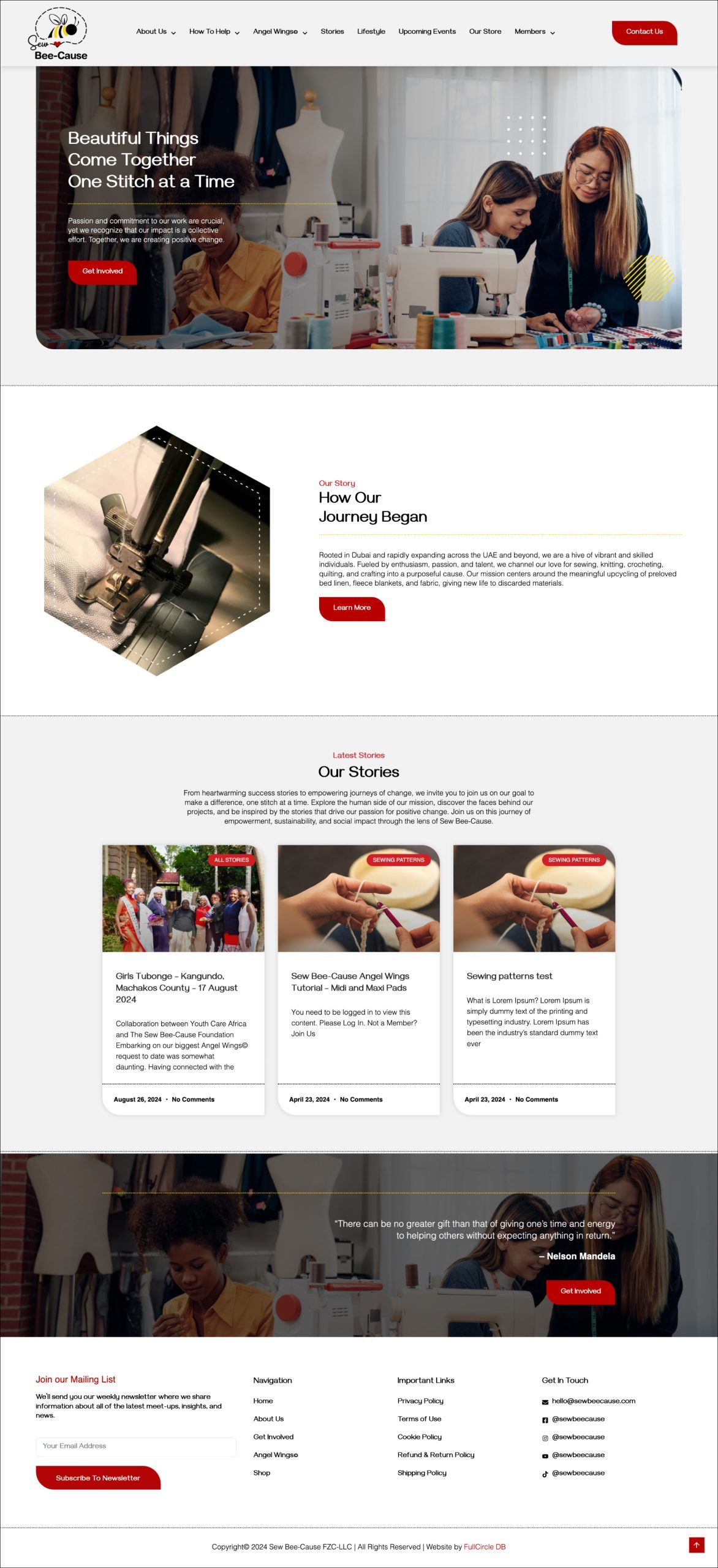
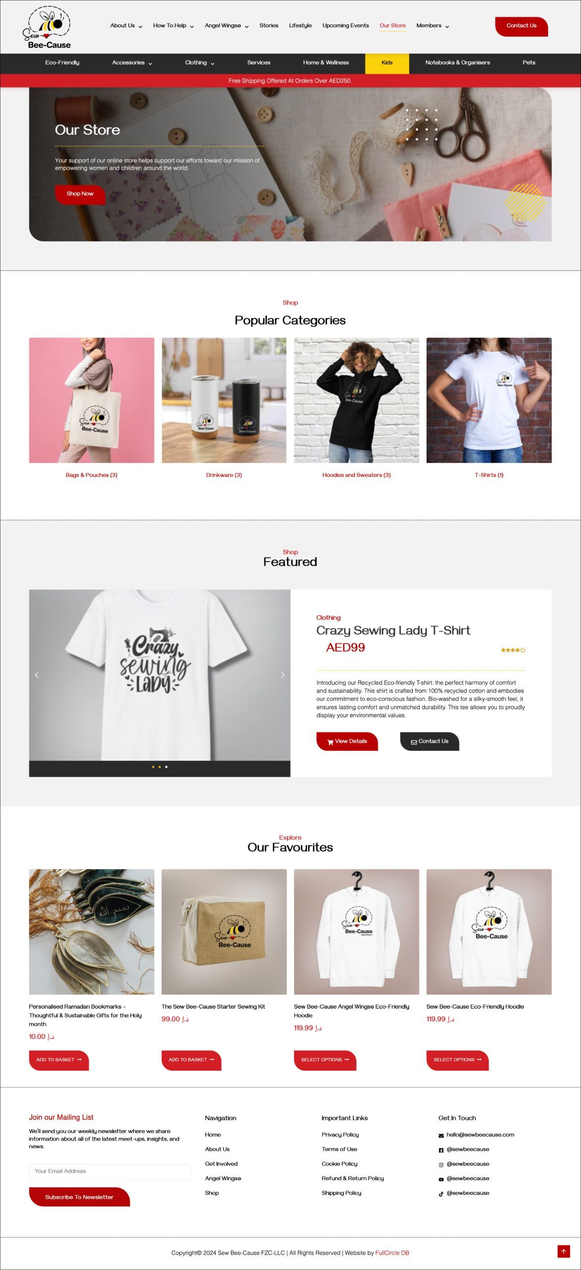
A fully redesigned WordPress website was developed to strengthen storytelling, improve programme visibility, and create clearer pathways for donations, partnerships, and community engagement.
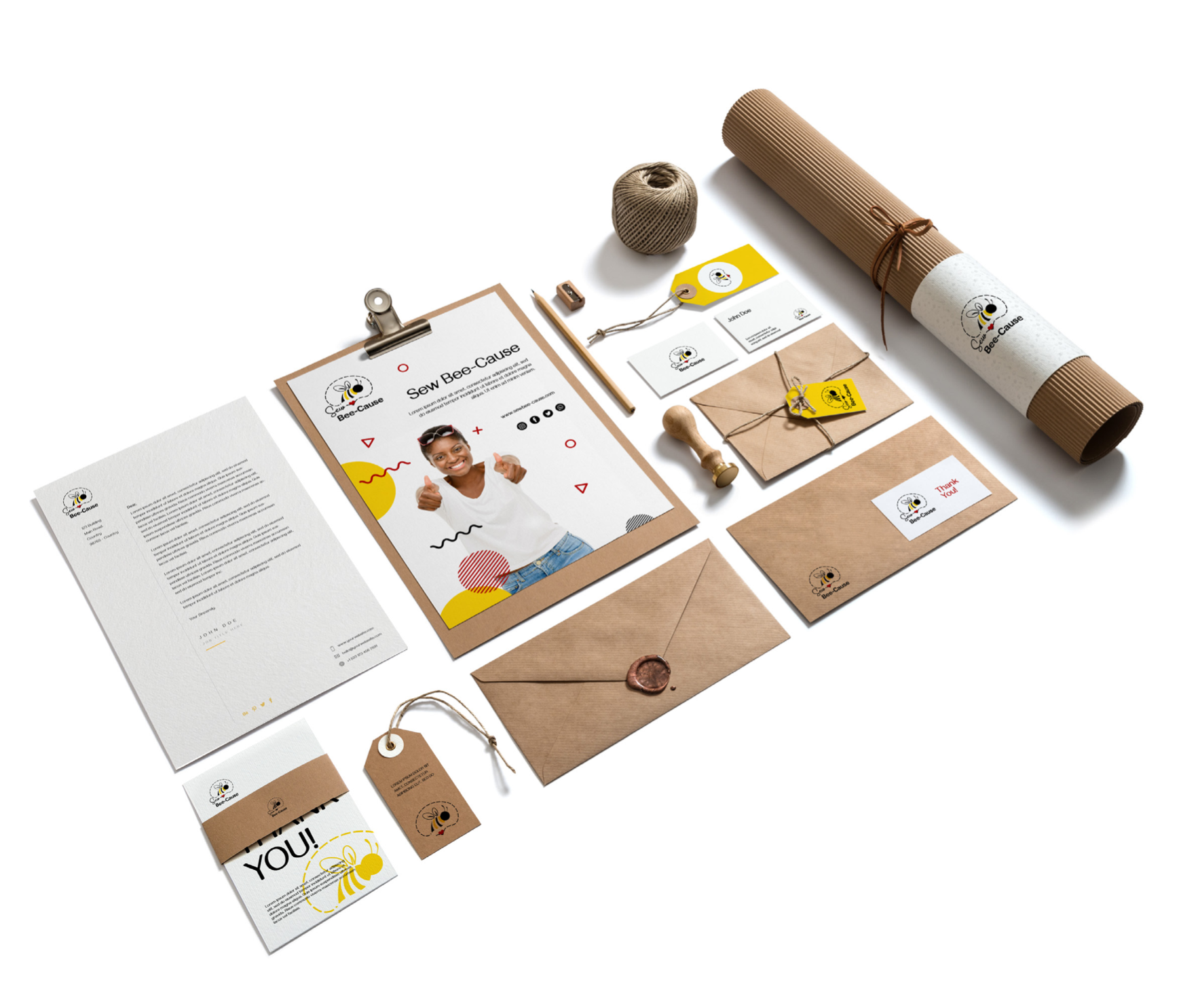
The visual identity was further extended across stationery, social media, branded communications, and supporting marketing materials, ensuring consistency across every touchpoint.
Deliverables
Brand Strategy, Brand Identity Design, Logo Design, Visual Identity System, Colour Palette, Typography System, Iconography, Brand Guidelines, Website Design, WordPress Development, UX/UI Design, Stationery Design, Social Media Templates & Digital Brand Assets

Results
Sew Bee Cause now has a modern and cohesive brand identity that reflects the purpose, optimism, and impact behind its work. The refreshed visual system strengthens credibility with donors and partners while creating a more engaging experience for the communities and individuals the organisation serves.
The redesigned website and unified brand identity provide a scalable platform for future growth, making it easier to tell meaningful stories, showcase programmes, increase visibility, and strengthen support for the organisation’s mission.